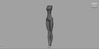
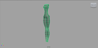
Im taking a break from the Jock to move onto the cheerleader. With some knowledge of the problems I encountered doing the Jock, the modelling of the cheerleader has been altered a little, mainly with the clothing and arms. So far I have the basic shape / proportions. The concept exaggerated the thinness of the waist a lot more, but after looking at the Jock, I don't think that will animate too well (or rather, at this stage I don't think I can rig/ skin it well enough) so I'm going to try and make up for the lack of style on the waist with the chest and head.
The skirt is just a basic mesh at the moment, I'm going to add more detail, a trim and some offset to make it look more cloth-like. I was going to look into using N-cloth, which will prove to be another thing to read up on. The head is going to need quite a bit of work to get it looking nice.
I was thinking about reference some Pin-up girls for their natural traditional beauty. I caught an image of Audrey Hepburn baking a cake the other day and haven't been quite the same since, the image below show a sort of style I think would go well.
Below is the progress of my, not so appealing Cheerleader, but give it time, she doesn't even have a head yet.
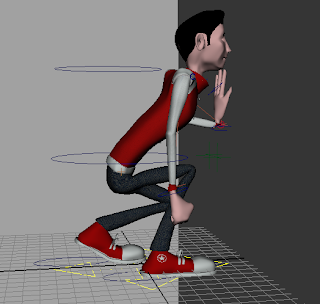
They say there is more than one way to skin a cat, unfortunately, there seems to be only one way to skin a teenage Jock, and it's not easy. I've been skinning for the last day or so and I think I'm almost there. Unfortunately, there are some problems with the model. The Legs, spine, neck, hips etc all seem to work fine, however the arms are far from perfect. I modelled the jock with his hands facing forwards, instead of downwards, I didn't even think about how the shoulders would bend, so there is an error with that.
The jock's arm doesn't really move much throughout the animation, just in one scene (where he throws a basketball) If I have time after the next character rig/skin then I'll go back and fix it, but for now, hopefully it will be OK.
The texture needs to be improved on this character, as well as the hair.It can then be split into three variations, using different hair pieces and face blendshapes. I need to do the facial animation blendshapes next and set up the eye look. This model is far from perfect, but I've learned a lot from it, and the next one should not have the same problems.
I've been getting back into work-mode and over the last day or so I've been rigging our Jock model, which will be split into three variations for our three jock characters. The rig is quite simple and I'm hoping there won't be too many problems when it comes to binding it to the model. Everything seems to be working so far!
It consists of 4 IKs, one on each arm and leg and two clusters on both the spine and neck, controlled by the buttons. I've been going back over Alan's tutorials as well as using the Autodesk Handbook.
It may need some tidying up before animating (Joints hiding, better looking controls) but for now I'm going to press on and try to get the character skinned. The skinning is the part which I think I'll have the most difficulty with but with some patience I think it will be OK. Optimistically, I want this Jock and the cheerleader rigged and skinned by the end of the weekend, so we can begin animation next week.
Updates:
I think the waist needs thinning, to exaggerate the tight figure, more like Rich's concept, but the flow is right, so I can alter the proportions slightly. I need to next create the skirt which will be attached and will cover the waist.
After looking at some more of Alan's tutorials on Rigging, I've decided to crack on and model the cheerleader, so that I have two characters to rig at once, which hopefully will make things easier. The stylistic proportion of the cheerleader is aimed at large hips, thin waist, long legs and large bust. The plan is to model the body and add the skirt on top, parenting it to the waist, hopefully this will work, but when it comes to rigging / skinning this will probably need a bit of attention.
Here is what I have so far, I'm hoping to have the whole model ready in the next few days for rigging and skinning. The model isn't naked, the top portion is in a cheerleading sweater, which explains the bulkier chest, it should be more obvious when the detail is added
I've been continuing work on the Jock. I'm hoping to finish him today along with the variations. We need 3 jocks for the trailer, all of which end up dead of course. The plan is to complete the current model and then change the textures and hair-style to be more efficient. I've textured him, but it may need to be improved. Im going to add to this post throughout the day as I progress. The hair needs UVing, Texturing and changing slightly on this variation.
Alan's film showing this week was 'Tremors', a comedic horror made directed by Ron Underwood. The plot centres around small isolated town in the American desert, which is experiencing unexpected underground tremors. It follows a 'comedy duo' of handymen, played by Kevin Bacon and Fred Ward who joined by a local female seismotologist, discover the source of the tremors - huge mutated worms, pillaging the area of livestock and eventually, it's residents
I first watched this film when I was about six, on a bootleg VHS, probably down to bad parenting , but I distinctly remember this film being the source for most of my early swear words. It still holds up today, both in comedy terms and effects. The use of huge amounts of blood and gore as well as early special effects really matches the absurdity of the creatures, ridiculously large worms, a creature which is usually seen as harmless.
The pace of the film is also perfect, with more people getting 'picked' off before realising what is killing people, eventually the film turns to the survivor's favour, having them fighting back against the creatures, which allows for plenty of over-exaggerate comedy. The messages throughout the film become clearer, especially with the stereotypes that feature throughout it, the 'redneck' type handymen, having to become heroic along with the all-american couple who have a ridiculous amount of firepower, pumping round after round into the gigantic worms.
Tremors has a Rotten Tomatoes rating of fresh with a 88% score, proving it's success in both it's comedy and special effects. Each death in the film gets more ridiculous and the dialogue in itself, is very clever. The film, although a comedy, is at the base, a horror, with there being some jump-in-seat moments and scares. Overall, this 50's movie pastiche is one of the more enjoyable takes on B-Movies and holds up very well in the modern day.
I've been working more on the Jock character, but it is still far from complete. No texture have been added yet, just quick mock-up colours. The head is the main thing that needs to be refined as we're heading for a more stylistic approach and this is a little generic cartoon so Im sure changes will be made. The body has the basic proportions and shape, the detail will be added soon such as Jean-Zipper, Buttons on Jersey, Insignia, Shoelaces etc.
The hair-style also needs to be decided, but as we're heading down the 80's road it will be quite retro (Not David Bowie mind you, the render time on a Bowie haircut would be incredible)
This is Richard's concept that I'm working from:
I have also UV'mapped the body, but not the head, because it will be changed.
The hair-style also needs to be decided, but as we're heading down the 80's road it will be quite retro (Not David Bowie mind you, the render time on a Bowie haircut would be incredible)
I've made a previous post on this essay, but it has been buried by my other work, so this post will be where I dump all my sources and structure so I can refer to it later and maybe receive some feedback. I'll be constantly updating this post for my own use.
I've made a quick draft of my essay on Blade Runner and have decided to consider the following post-modern topics which resonate throughout the film:
Firstly, the class-divide in the film, showing a future world where if the distance between social classes isn't increased, then it is hugely exaggerated. I'll be refering this to David Harvey's " THE CONDITION OF POSTMODERNITY: AN ENQUIRY INTO THE ORIGINS OF CULTURAL CHANGE." which I need to look into further. This will focus on not only the architecture of the film and the mise-en-scene, but also the characters and their social positions.
for this topic:
Bruno, G. (1990). Ramble city: postmodernism and Blade Runne
Davis, M. (1992). City of Quartz: Excavating the Future in Los Angeles. London: Vintage.
Harvey, D. (1989c). Flexible accumulation through urbanization: reflections on "Post-Modernism" in the American city
-------------------------------------------------------------------------------------------------
The other possibility is to base the essay on the Pastiche, analysing the architectural designs in the film, which echo of different eras of the past, as well as the clothing, which is a mixture of futuristic yet post-war retro.I think this may make a stronger essay, but more research will tell. For this, I would use the below sources (plus more, of course)
Postmodernism and Cultural Theories - Fredric Jameson
Postmodernism, or The Cultural Logic of Late Capitalism - Fredric Jameson
Bruno, G. (1990). Ramble city: postmodernism and Blade Runner
After missing Tuesday's Transcription briefing I've read through the assesment criteria and brief and I'm beginning to think about possiblities. After thinking about it and considering the projects I've worked on in the past, I'd love to transcribe a children's book to 3D. The first book I thought of, was one that although popular, is not the most widely known : Enid Blyton's The Faraway Tree.
The brief states: it needs to be a "complex project that exploits the aesthetic possibilities of digital environments." and this book, as I remember it, has such a rich description and basis of environment as well as characters, which I think would make it a perfect choice for a children's adaption.
I would have to decide whether to focus on Environment or Character, however, not focusing on characters from this book would be a huge opportunity missed. Two characters from this book really stick out in my mind - Moonface, a smartly dressed character with a massive moon-like head and The Saucepan Man, who is obviously, a man covered in Saucepans. There is also the possibility of creating the main characters from the book, the children who find the tree.
I'm going to leave this as a possibility as well as looking at other book options.
It's been a rubbish week, with snow, blocked roads and freezing temperatures, but all snow-clouds have a silver lining and this time it happens to be that there is plenty of time for knuckling down on Maya. The forest scene in the previous post is coming along, the background is next, it needs to be painted in Photoshop and set-up to blend with the foreground. I've taken a quick break from that scene, to begin a bit of character work. Alan's previous tutorials have helped immensley with this. I've started with one of our characters which Richard designed : the Jock. I have the basic shape, it needs a lot of detail and tweaking, but it's getting closer to the design.
Update:
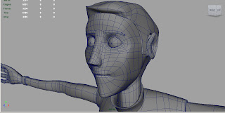
I've been re-visiting a lot of Alan's earlier tutorials and the head is getting there. I think we need to thrash out a bit more of a style for the face, but as a basic shape I think its working. Im trying to make the jaw sharper, as Richard's concept shows, we want the jocks to have strong athletic jaw-lines. I've also increased the size of the eyes to give it a cartoon-like style to match the colour scheme and body shape. Lots still to do (Including nostrils and ears) and of course the hair, which is going to be a classic 80's cheese.


